Waqua Turizm Ekipmanları

Home
What Have We Done?
Logo Design
Waqua Turizm Ekipmanları

Waqua Turizm Ekipmanları

Waqua Turizm Ekipmanları

Waqua Turizm Ekipmanları

Waqua Turizm Ekipmanları

Waqua Turizm Ekipmanları

Waqua Turizm Ekipmanları

Waqua Turizm Ekipmanları

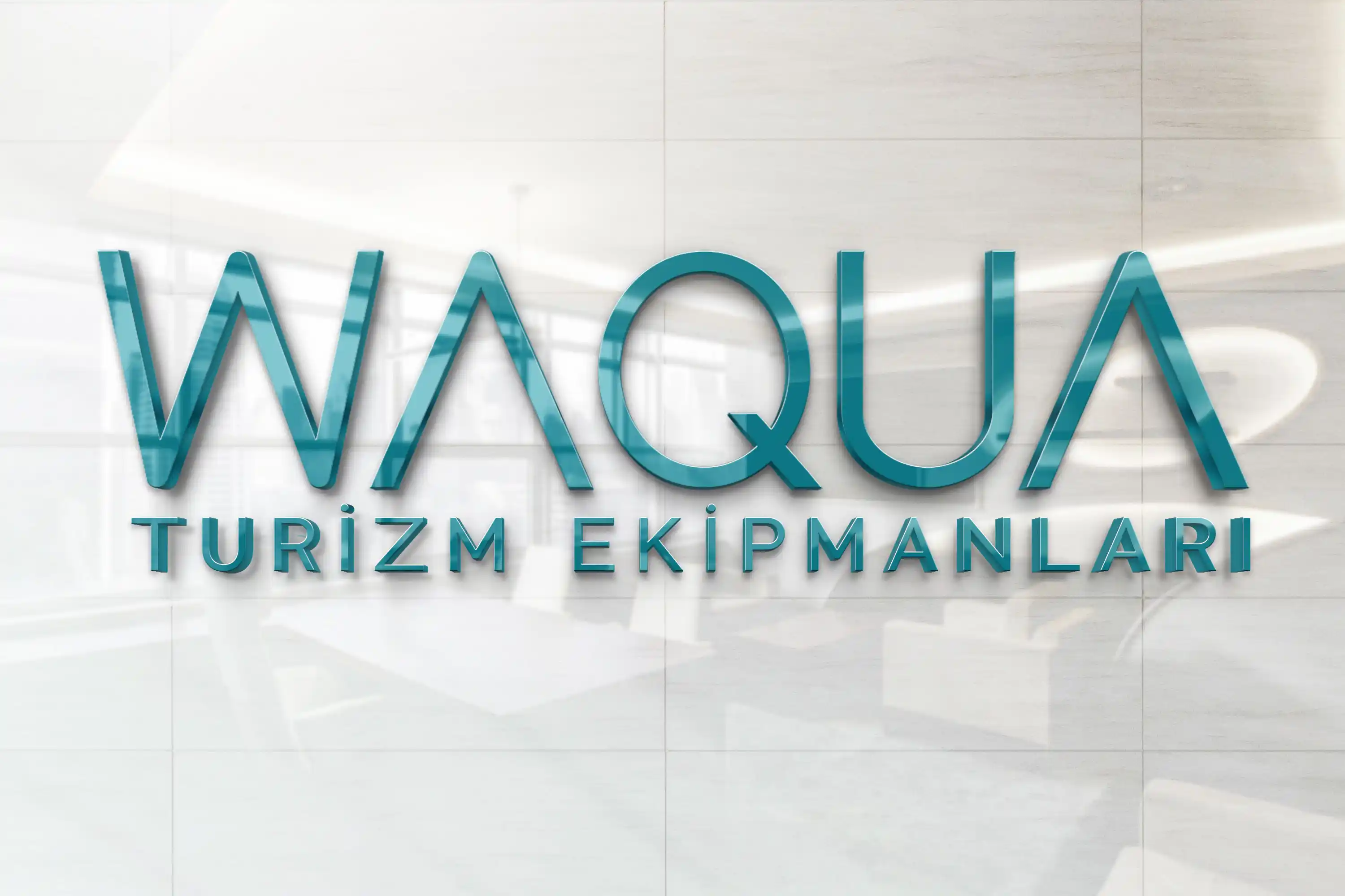
In the logo design we prepared for Waqua, we reflected the brand’s modern and innovative approach to the tourism sector through simple typography. Thanks to the geometric and fluid forms used in the lettering, we created a distinctive brand appearance that evokes the concepts of water, cleanliness, and movement.

While the turquoise tone highlights feelings of freshness, hygiene, and trust, the thin and balanced typeface supports the brand’s professional structure. With the phrase “Tourism Equipment” positioned below, the logo directly communicates the brand’s field of activity and offers a modern, memorable identity suitable for use on products, at trade fairs, in catalogues, on corporate documents, and across digital platforms.
Company Name: Waqua Turizm Ekipmanları

Industry: Tourism Equipment

Service Provided: Web Design / Corporate Identity / Social Media / Photography & Production / Logo Design / Brand Development

Waqua Turizm Ekipmanları

What Does Our Logo Represent?

As Waqua owns brands such as IKARUS, THEMA, Hemetra, and Rapid, it needed a logo that could also be incorporated into the logos of its other brands. With this in mind, we adopted a simple design that conveys a sense of technology. We used turquoise—a colour that evokes stability, supports attention and concentration, symbolises change and transformation, and whose name itself originates from Türkiye’s clean, crystal-clear waters—to create a design aligned with our company’s purpose and industry.


whatsapp