Kaplanlar İnşaat & Gayrimenkul

Home
What Have We Done?
Logo Design
Kaplanlar İnşaat & Gayrimenkul

Kaplanlar İnşaat & Gayrimenkul

Kaplanlar İnşaat & Gayrimenkul

Kaplanlar İnşaat & Gayrimenkul

Kaplanlar İnşaat & Gayrimenkul

Kaplanlar İnşaat & Gayrimenkul

Kaplanlar İnşaat & Gayrimenkul

Kaplanlar İnşaat & Gayrimenkul

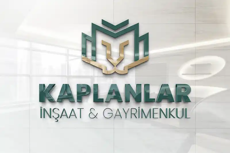
In the logo design we prepared for Kaplanlar İnşaat & Gayrimenkul, we integrated the brand’s strong and trustworthy structure with architectural forms. By combining geometric lines that evoke a building silhouette with a tiger face in a single emblem, we highlighted the concepts of strength, determination, and solidity.

With the dark green tone, we emphasised trust, stability, and corporate identity; with the gold tone, we highlighted value, prestige, and investment strength. Supported by strong typography, the logo offers an original and memorable identity that can professionally represent the brand on project signboards, corporate documents, sales offices, advertisements, and digital platforms.
Company Name: Kaplanlar İnşaat & Gayrimenkul

Industry: Logo Design

Service Provided: Construction / Real Estate

Kaplanlar İnşaat & Gayrimenkul

What Does Our Logo Represent?

Turquoise, formed by combining blue with a small amount of yellow, lies on the colour spectrum between green and blue. Drawing on the tranquillity and calmness of blue and the balance and energy of green, turquoise creates a peaceful and serene feeling when focused on. Yellow, the colour of the sun and gold, represents life, wealth, success, and status. In addition to evoking prestige, quality, and prosperity, it also has an attention-grabbing quality. By combining yellow with dark turquoise, we highlighted yellow and brought wealth, success, and status together with peace and calmness, thereby emphasising quality.

The renowned physicist Alan Lightman said, “Symmetry is economy. Symmetry is simplicity; symmetry is elegance.” The reason is that symmetry, which appears in many aspects of nature, feels familiar to people and therefore creates a sense of satisfaction. For this reason, inspired by the brand name, we included a tiger figure in our logo and made use of symmetry through simple lines.


whatsapp